Python中文网 - 问答频道, 解决您学习工作中的Python难题和Bug
Python常见问题
如何根据以下条件选择条形图条形图内文本批注的字体大小:
- 文本将完全覆盖矩形条区域
请仔细阅读图表和代码,以便更清楚地了解问题
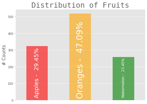
因此,要求仅为:字体大小应与条形图中的条形图相对应
代码
import pandas as pd
import numpy as np
import matplotlib.pyplot as plt
import matplotlib as mpl

# Plot styles
mpl.style.use("ggplot")

# data
fruits = pd.Series(index = ["Apples", "Oranges", "Watermelon"], data = [324,518, 258])


# Bar graph for Fruits

# figure
plt.figure(figsize = (7,5))

# bar graph
fruits.plot(kind = "bar", color = ["red", "orange", "green"], alpha = 0.6, width = 0.5, )

# percentage of each fruit type
categories = list(fruits.index)
categories_percent = [100*(value/fruits.sum()) for value in fruits ]

# categories annotations coordinates
ax = plt.gca() # get current axes
rects = ax.patches # rectangles axes of bars in the graph

# annotations
for i in range(len(categories)):
    plt.annotate(f"{categories[i]} - {categories_percent[i] : 0.2f}%",
                 xy = (rects[i].get_x() + rects[i].get_width()/2,
                       rects[i].get_y() + (ax.get_yticks()[1] - ax.get_yticks()[0])*.2),
                 fontsize = [20,28,12][i], # Chosen by hit and trial for adjustment
                 color = "white",
                 ha = "center",
                 rotation = 90,
                 )

plt.ylabel("# Counts", fontsize = 15,)
plt.title("Distribution of Fruits", fontsize = 25, fontname = "Monospace", alpha = .6)
plt.xticks([])
plt.tight_layout(rect=[0, 0, 1, 1])
plt.show()
如何处理这行代码fontsize = [20,28,12][i], # Chosen by hit and trial for adjustment以根据条形图区域动态调整字体大小
Tags: of代码importforgetaspltax
热门问题
- 是什么导致导入库时出现这种延迟?
- 是什么导致导入时提交大内存
- 是什么导致导入错误:“没有名为modules的模块”?
- 是什么导致局部变量引用错误?
- 是什么导致循环中的属性错误以及如何解决此问题
- 是什么导致我使用kivy的代码内存泄漏?
- 是什么导致我在python2.7中的代码中出现这种无意的无限循环?
- 是什么导致我的ATLAS工具在尝试构建时失败?
- 是什么导致我的Brainfuck transpiler的输出C文件中出现中止陷阱?
- 是什么导致我的Django文件上载代码内存峰值?
- 是什么导致我的json文件在添加kivy小部件后重置?
- 是什么导致我的python 404检查脚本崩溃/冻结?
- 是什么导致我的Python脚本中出现这种无效语法错误?
- 是什么导致我的while循环持续时间延长到12分钟?
- 是什么导致我的代码膨胀文本文件的大小?
- 是什么导致我的函数中出现“ValueError:cannot convert float NaN to integer”
- 是什么导致我的安跑的时间大大减少了?
- 是什么导致我的延迟触发,除了添加回调、启动反应器和连接端点之外什么都没做?
- 是什么导致我的条件[Python]中出现缩进错误
- 是什么导致我的游戏有非常低的fps
热门文章
- Python覆盖写入文件
- 怎样创建一个 Python 列表?
- Python3 List append()方法使用
- 派森语言
- Python List pop()方法
- Python Django Web典型模块开发实战
- Python input() 函数
- Python3 列表(list) clear()方法
- Python游戏编程入门
- 如何创建一个空的set?
- python如何定义(创建)一个字符串
- Python标准库 [The Python Standard Library by Ex
- Python网络数据爬取及分析从入门到精通(分析篇)
- Python3 for 循环语句
- Python List insert() 方法
- Python 字典(Dictionary) update()方法
- Python编程无师自通 专业程序员的养成
- Python3 List count()方法
- Python 网络爬虫实战 [Web Crawler With Python]
- Python Cookbook(第2版)中文版
fontsize更新现有注释y作为高度的比例因子.get_height视为图形的相对高度.get_height.get_width(不是get_width*x),但是它只是一个常量,因为它是相对宽度对于figsize=(15,15):
对于figsize=(8,8):
对于figsize=(7,5):
相关问题 更多 >
编程相关推荐